Most plumber websites say the same thing: licensed, reliable, affordable, call us today. That is not enough anymore.
We looked through 25 local plumber websites and compared what the strongest ones do differently. The top sites were not the prettiest. They were the clearest. They made it dead easy for someone with a burst pipe, blocked drain, or no hot water to call fast.
If your plumber website is getting visits but not many calls, this is the stuff to fix first.
Quick wins
- Put your phone number and emergency CTA above the fold.
- Show the exact suburbs and plumbing jobs you want.
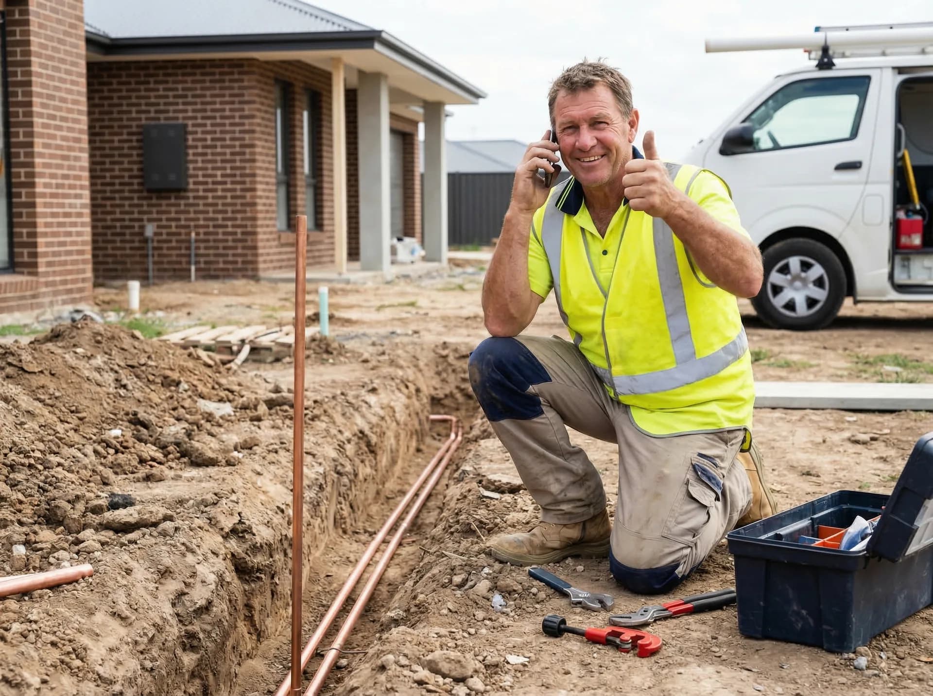
- Use real job photos, not stock images.
- Make your quote form short enough to finish on a phone.
- Show proof: reviews, licences, response times, and guarantees.
Want to know what your website is costing you?
Submit your site and we'll send a quick audit showing what to fix first.
Point 1
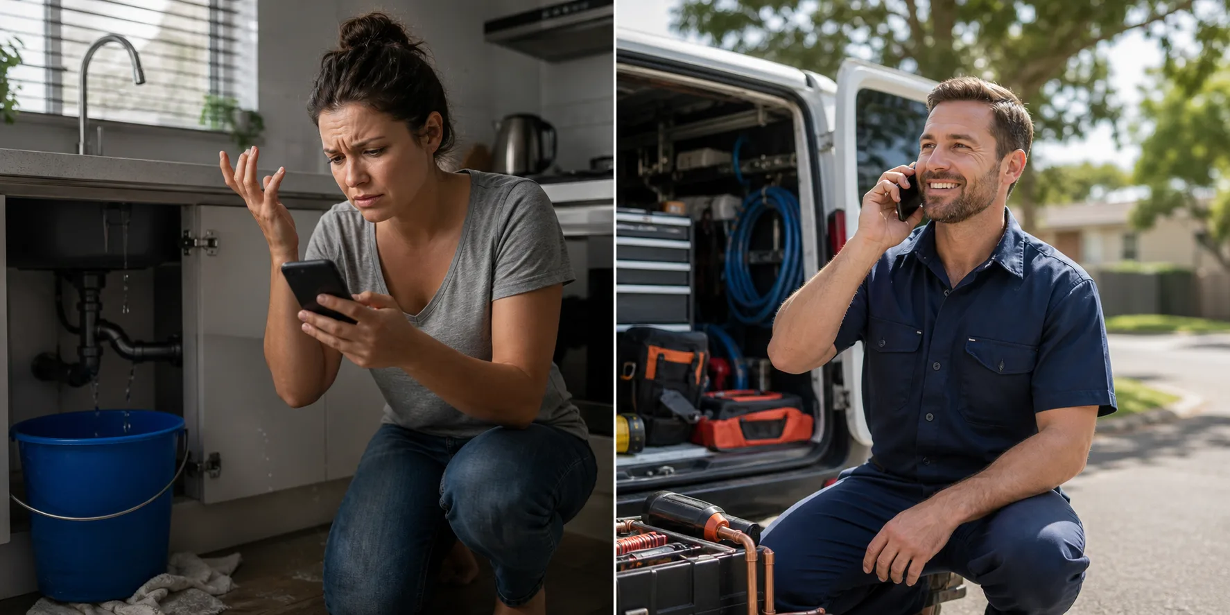
The best plumber websites make the phone call obvious
When someone has water coming through the ceiling, they are not reading your company story. They want to know one thing: can you help, and how fast can they reach you?
The weaker sites buried the phone number in the footer or hid it behind a tiny contact link. The better sites had a tap-to-call button in the header, another one in the hero, and clear wording like emergency plumber available.
What to do: Add a sticky mobile call button, a clear emergency CTA, and your service area in the first screen.

What the visitor sees vs what helps them enquire
Not enough to win the job
Phone hidden in footer
The customer has to guess, wait, or trust you without proof.
Generic contact button
The customer has to guess, wait, or trust you without proof.
No emergency wording
The customer has to guess, wait, or trust you without proof.
Better way to set it up
Tap-to-call in header
The customer knows what to do and why they should pick you.
Emergency CTA above fold
The customer knows what to do and why they should pick you.
Suburb shown early
The customer knows what to do and why they should pick you.
Point 2
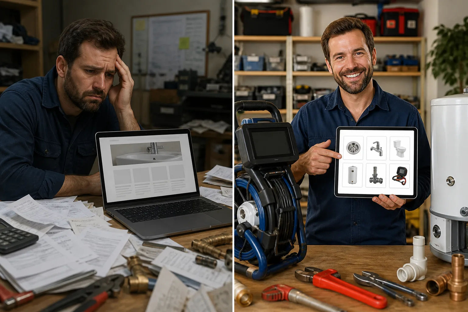
They talk about real plumbing jobs, not vague services
A page that says plumbing services is too broad. Real customers search for blocked drains, hot water repairs, toilet leaks, gas fitting, roof leaks, and emergency plumbing in their suburb.
The better sites had clear service blocks and separate wording for the jobs they actually want. That helps Google understand the page and helps the customer feel like they are in the right place.
What to do: List your top services in plain words and link important ones to their own pages over time.

What the visitor sees vs what helps them enquire
Not enough to win the job
General services
The customer has to guess, wait, or trust you without proof.
No job examples
The customer has to guess, wait, or trust you without proof.
No suburb wording
The customer has to guess, wait, or trust you without proof.
Better way to set it up
Blocked drains
The customer knows what to do and why they should pick you.
Hot water repairs
The customer knows what to do and why they should pick you.
Emergency plumber Pakenham
The customer knows what to do and why they should pick you.
Point 3
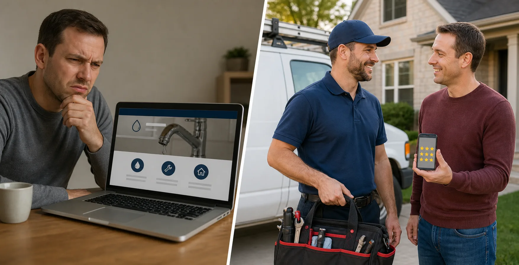
They prove trust before asking for the job
People do not invite a plumber into their home just because a website looks nice. They want signs you are real, licensed, insured, and trusted by other locals.
The strongest sites showed Google reviews, licence details, local job photos, and short proof points near the top. The weaker sites made visitors hunt for proof or gave them none at all.
What to do: Put your review score, licence note, and two or three short trust points near your main CTA.

What the visitor sees vs what helps them enquire
Not enough to win the job
Stock van photo
The customer has to guess, wait, or trust you without proof.
No reviews
The customer has to guess, wait, or trust you without proof.
No licence details
The customer has to guess, wait, or trust you without proof.
Better way to set it up
4.8 star review badge
The customer knows what to do and why they should pick you.
Licensed and insured
The customer knows what to do and why they should pick you.
Real local job photos
The customer knows what to do and why they should pick you.
Point 4
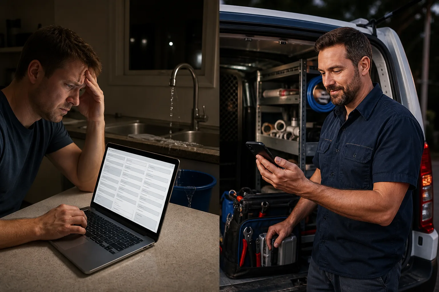
Their mobile pages are built for thumbs
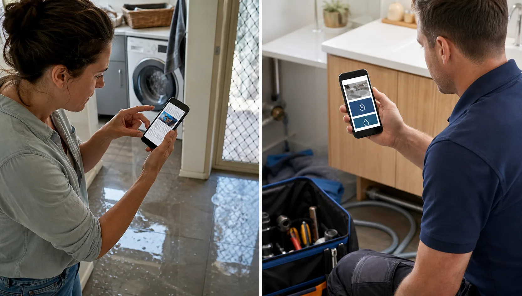
Most emergency plumbing searches happen on a phone. If your form is tiny, your menu is awkward, or the phone number is hard to tap, you are losing work before the person even reads your page.
The top sites had short sections, big buttons, no pinch-to-zoom, and contact options that stayed easy while scrolling.
What to do: Check your site on your own phone. If calling, reading, or submitting a quote request feels annoying, fix mobile first.
What the visitor sees vs what helps them enquire
Not enough to win the job
Tiny text
The customer has to guess, wait, or trust you without proof.
Hard-to-tap buttons
The customer has to guess, wait, or trust you without proof.
Long form
The customer has to guess, wait, or trust you without proof.
Better way to set it up
Large call button
The customer knows what to do and why they should pick you.
Short quote form
The customer knows what to do and why they should pick you.
Easy scroll sections
The customer knows what to do and why they should pick you.
Point 5
They make the next step feel low-risk
A lot of plumber websites ask for too much too soon. Big forms, vague pricing, and no idea what happens next can stop people from enquiring.
The better sites used simple CTAs like request a callback, get a fast quote, or book an emergency callout. They also explained what happens after the form is submitted.
What to do: Use a short form with name, phone, suburb, and job type. Tell visitors when you will reply.

What the visitor sees vs what helps them enquire
Not enough to win the job
10-field form
The customer has to guess, wait, or trust you without proof.
No response time
The customer has to guess, wait, or trust you without proof.
Vague submit button
The customer has to guess, wait, or trust you without proof.
Better way to set it up
4 quick fields
The customer knows what to do and why they should pick you.
Reply time shown
The customer knows what to do and why they should pick you.
Clear callback CTA
The customer knows what to do and why they should pick you.
Want to know what your website is costing you?
Submit your site and we'll send a quick audit showing what to fix first.
Frequently Asked Questions
What should a plumber website include?
A plumber website should include tap-to-call buttons, services, suburbs, emergency wording, reviews, licence proof, job photos, and a short quote form. The goal is to make trust and contact easy.
Do plumbers need local SEO?
Yes. Plumbers rely on local searches like blocked drain near me or emergency plumber in a suburb. Local SEO helps Google connect those searches with your website and Google Business Profile.
How can a plumber get more website enquiries?
Make the site faster, clearer, and easier to contact. Put your phone number high, show proof, use local service wording, and keep forms short.
Want a website that turns visitors into enquiries?
BuildSpark builds fast, local-focused websites that make the next step obvious. Submit your site above or start the quiz and we'll show you what we'd fix first.
Start Your Free Quiz