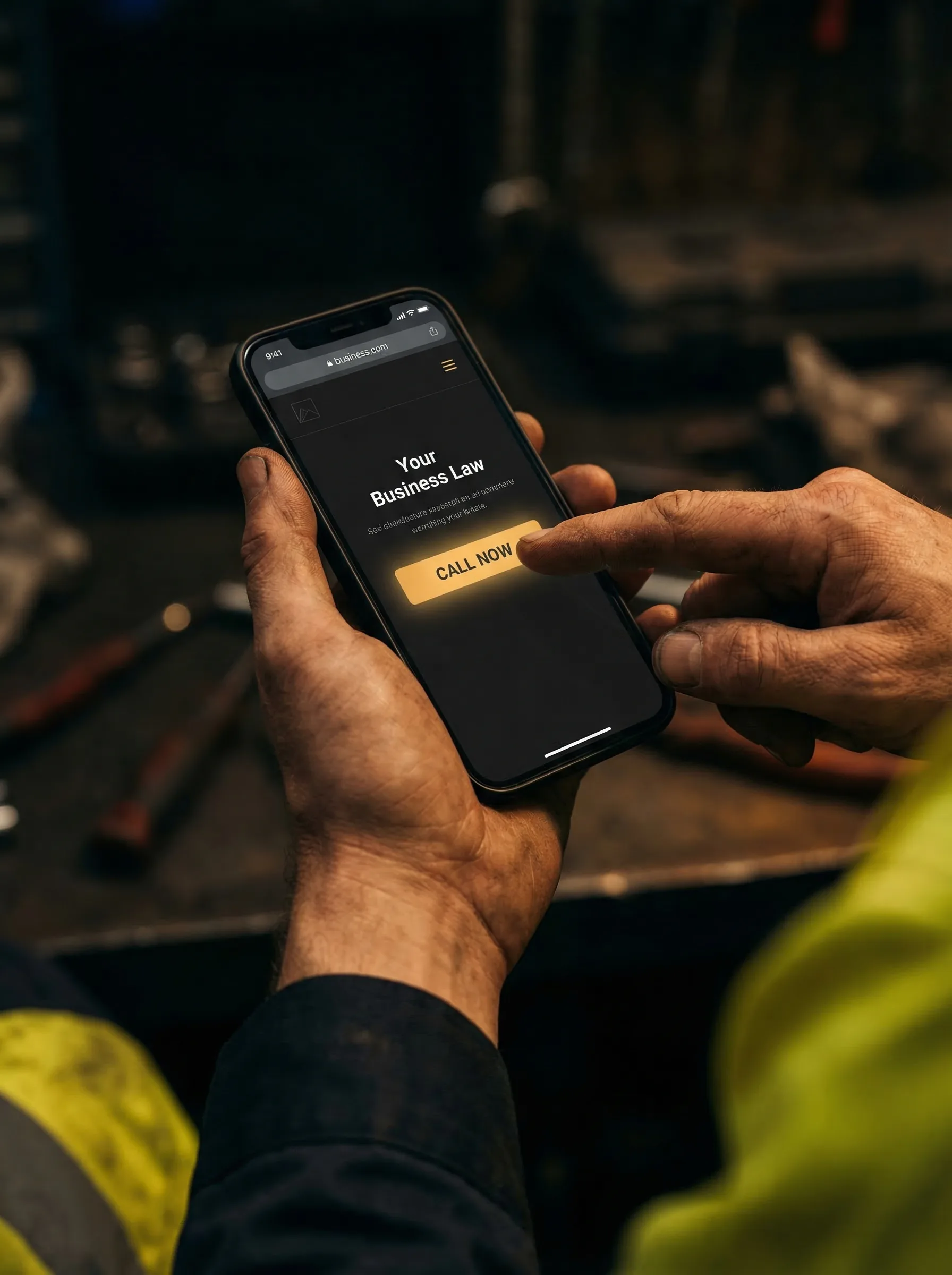
Most website visitors do not leave because they hate your business. They leave because the page makes calling, trusting you, or asking for a quote harder than it should be.
Point 1
Visitors leave when the first screen is unclear
A busy customer will not work hard to figure out what you do. If the first screen is vague, they assume they are in the wrong place.
Strong local websites say the trade or service, the area, and the result straight away. No cute headline. No mystery. Just clear and useful.
Fix this: Use a headline like electrician in Ballarat, same-week bookings, free quote instead of welcome to our website.
Point 2
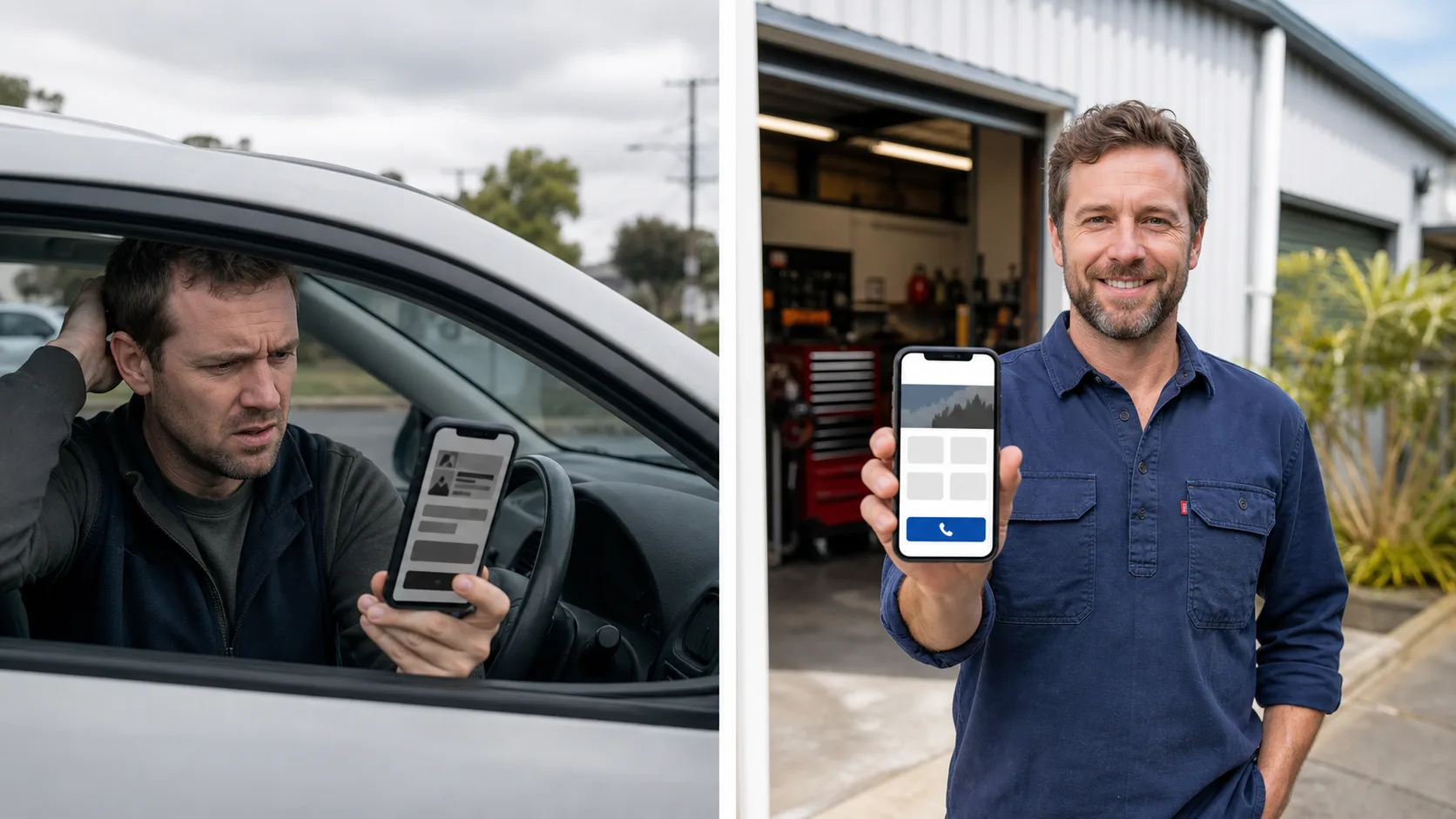
They do not trust you yet
People are cautious. Before they send a form or call, they want to know you are real and safe to deal with.
If your reviews, photos, ABN, licence, or results are missing, the visitor has to take a risk. Most will just go back to Google and click the next business.
Fix this: Add reviews, real photos, years in business, licences, and a short guarantee close to the first CTA.
Point 3
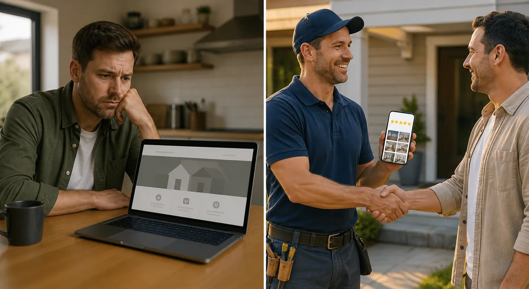
Your form asks for too much
A long form feels like homework. On a phone, it feels even worse.
Most local enquiries only need a name, phone, service, suburb, and a short message. You can ask the rest when you call back.
Fix this: Keep the main form under five fields and make the submit button say what happens next.

Point 4
The call button is too hard to find
Local customers often want to call, especially for urgent jobs. If your number is a small line of text or only on the contact page, you are making them work.
Good websites treat the phone call like the main action. The number is visible, tappable, and repeated in the right places.
Fix this: Use a sticky mobile call button and place tap-to-call links in the header, hero, and final CTA.

Point 5
Your site is slow when people are ready to act
Slow websites do not just feel annoying. They create doubt. If the page loads badly, the visitor wonders if the business is just as rough behind the scenes.
A fast site makes the business feel organised. It also keeps people around long enough to read, trust, and enquire.
Fix this: Compress images, remove heavy effects, and test the site on mobile data, not just office Wi-Fi.

Want a brand new website from $150/m*?
Limited August spots remaining. Send your details and we'll confirm if your area is still available.
*$150/m website offer is for eligible BuildSpark monthly website plans. Limited August onboarding spots.
Frequently Asked Questions
Why do people visit my website but not contact me?
Usually the page is unclear, slow, hard to use on mobile, missing trust proof, or asking too much in the form. Fix those before spending more on ads.
What is a good website enquiry rate?
It depends on the trade and traffic quality, but a local service website should usually aim to turn more visitors into calls or quote requests by making contact simple and visible.
Should I use a phone CTA or contact form?
Use both. Urgent customers often call, while price-shopping customers may prefer a form. Make both easy and keep the form short.
Want this fixed with a brand new website from $150/m*?
BuildSpark builds fast, local-focused websites that make calls, bookings, and quote requests obvious. Limited August spots remaining.
Start My $150/m Website*For eligible monthly website plans. Final inclusions confirmed before you start.